THE CHALLENGE
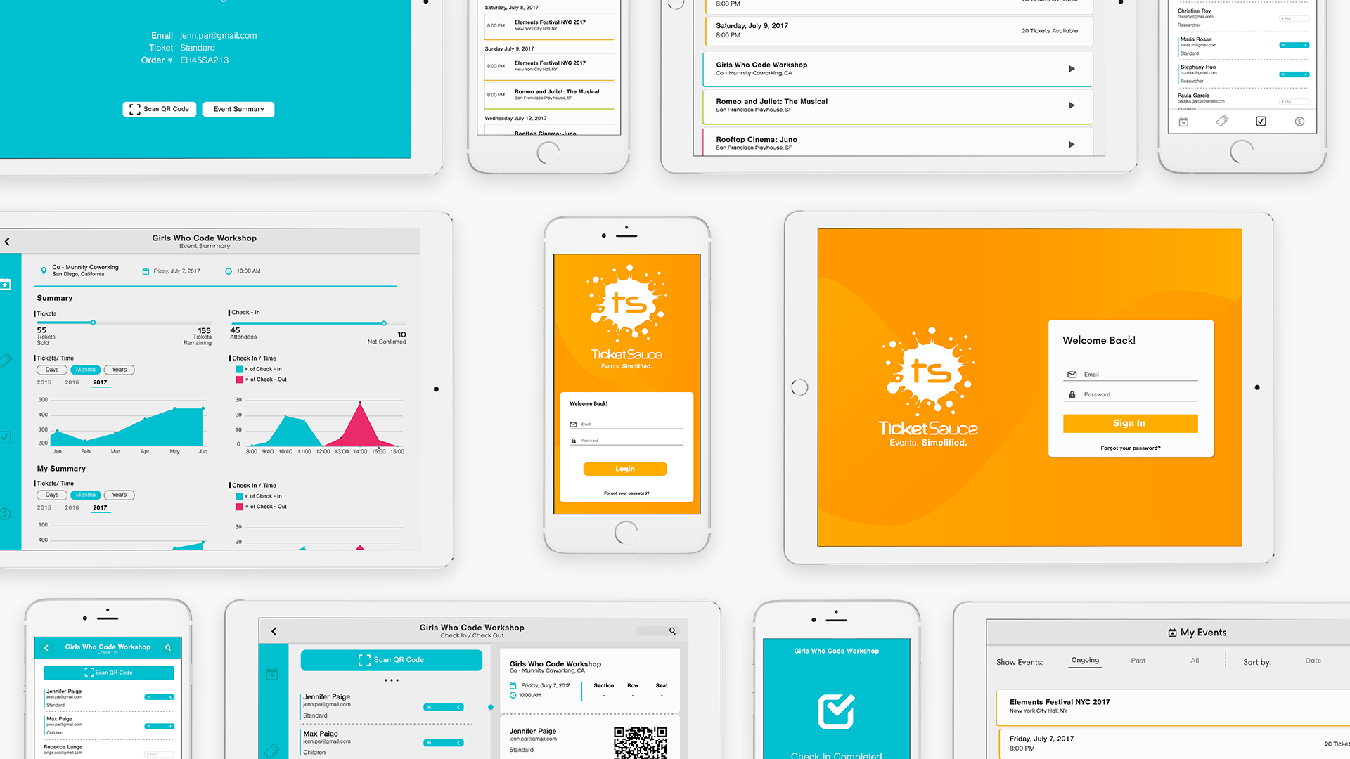
Improve Ticket Sauce’s Ipad and Iphone app interface and user experience.
MY ROLE
UX & UI Designer. Worked with Paula Garcia
TOOLS
AI, PS and Adobe XD
TOOLS
AI, PS and Adobe XD
Ticket Sauce is an event ticketing platform that helps people organize and manage their events on-location. The company wanted to improve their app usability and accessibility so new and experienced users could get access to all of the features they offer in a reliable and quick way. We were tasked with giving their app the boost it needed.
The design process started by identifying the user base of the app and identifying their needs. We did some research in order to get an idea of their user base and to identify questions or pain points that often came up for new users.
From this research we identified that: the users are not attendees of the event, rather they will be the people realizing check-ins, selling tickets or working behind the scenes making sure everything works, we also established that navigation was confusing to new users, and that users had difficulty understanding the flow between different dashboards or tasks. In order to solve these problems, we decided to redesign the dashboard experience by laying out the following goals:
- Strengthen visual hierarchy and navigation patterns to create a "short" learning curve.
- Reduce and eliminate inconsistencies by establishing conventions for how pages should be laid out, how buttons should be colored and positioned depending on their purpose, and how copy should be written
UI DESIGN
Based on our user research findings and the design brief provided by Ticket Sauce, we sketched and mocked up dozens of layouts that worked around the idea of guiding the user seamlessly through the interaction so he could glide from one task to the other with as little pushback as possible.
After sketching, designing mockups, listening to the client feedback and iterating our final proposal looked like this:
IPAD
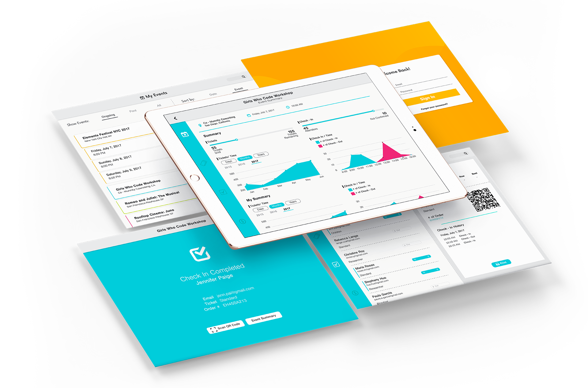
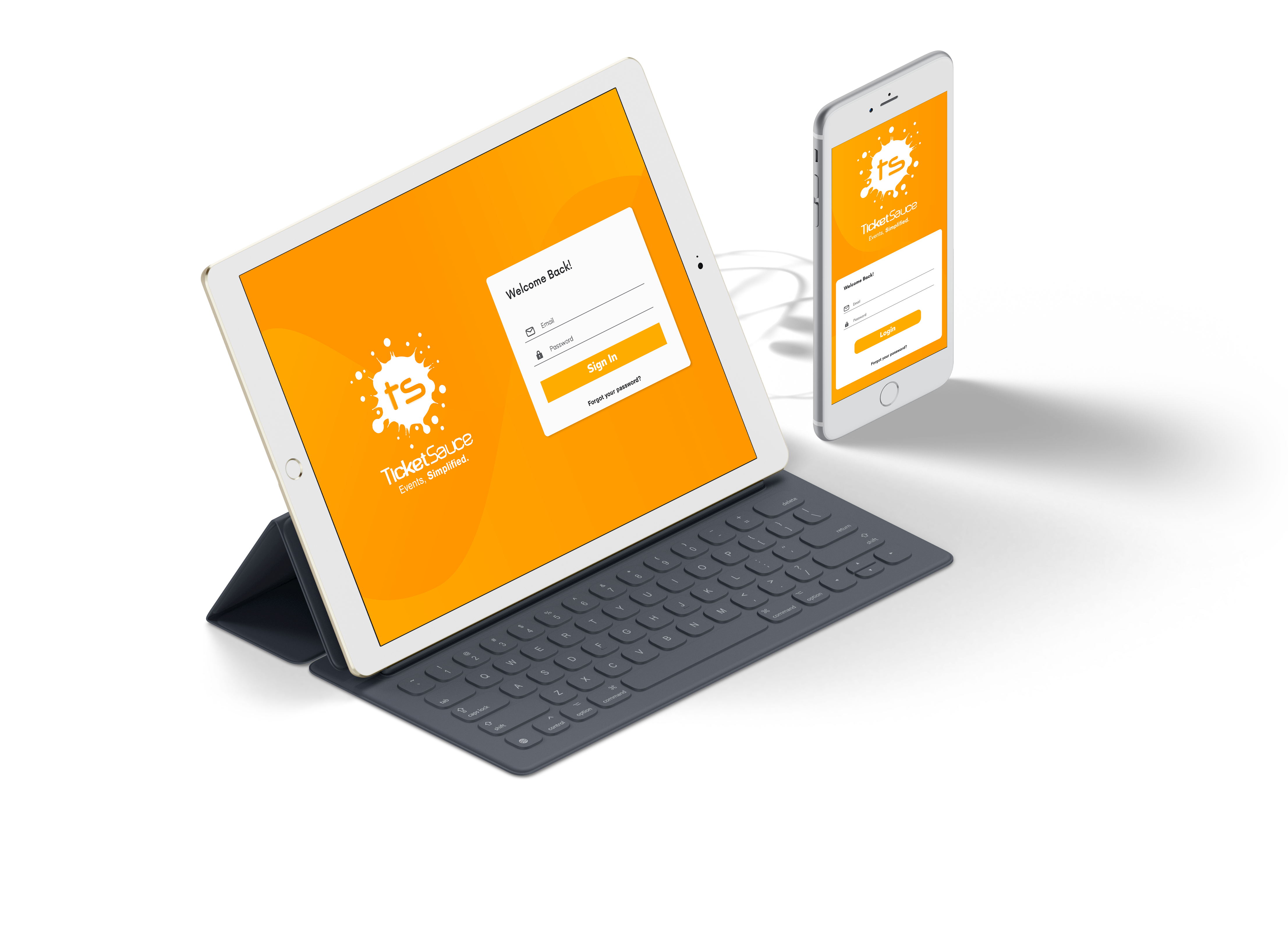
The Ipad UI was designed to enhance task speed and ease the transition between them. On the left side we have a vertical bar with the 4 main tasks someone would use in an event: Selling Tickets, Check-In of attendees, Managing orders and the home screen with information and real time data about the event. We used every inch on screen real state to convey information and ease of access to important functions.
Every event is identified by a different color in order to give the user a visual indicator in order to avoid mistakes when selling tickets for different events.
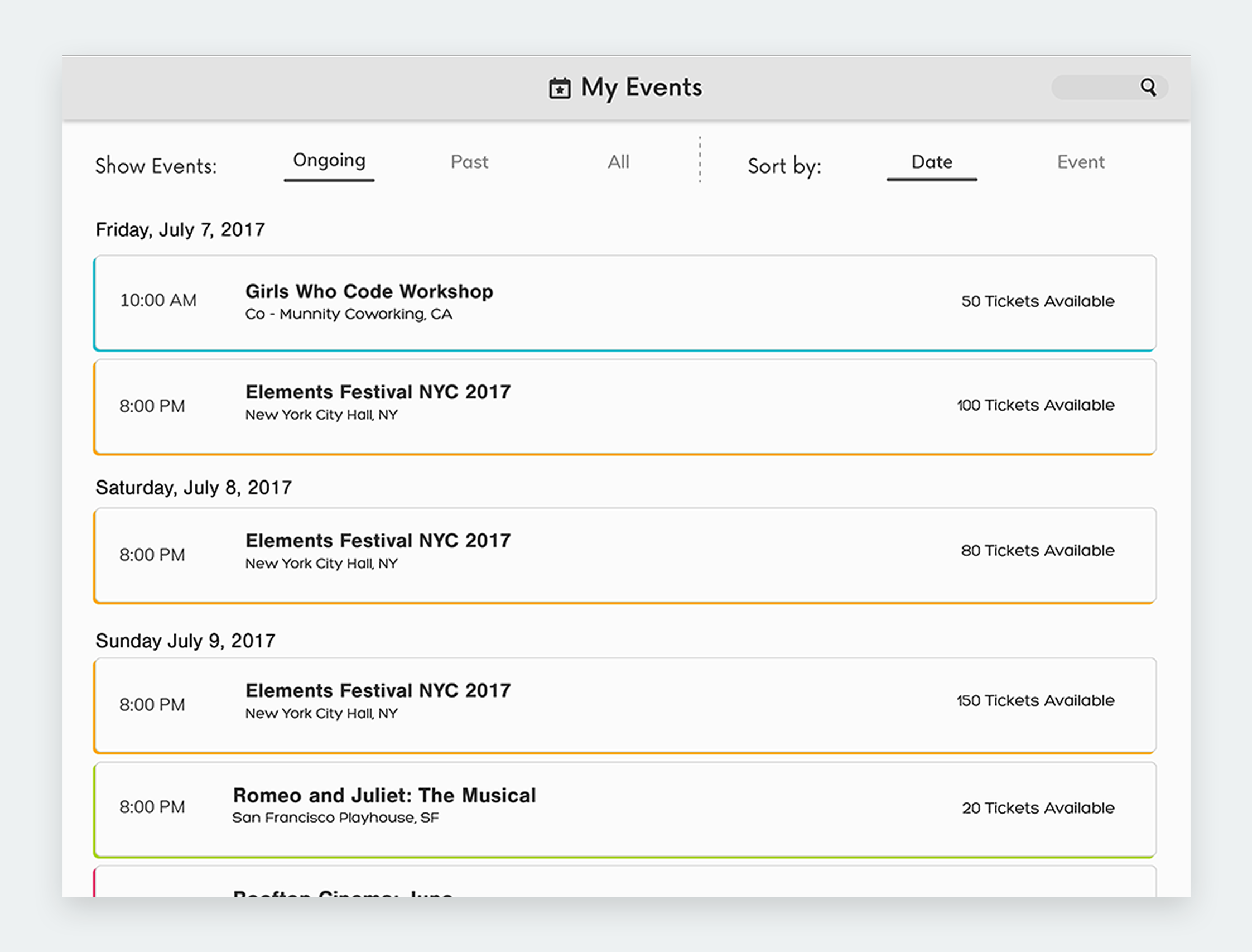
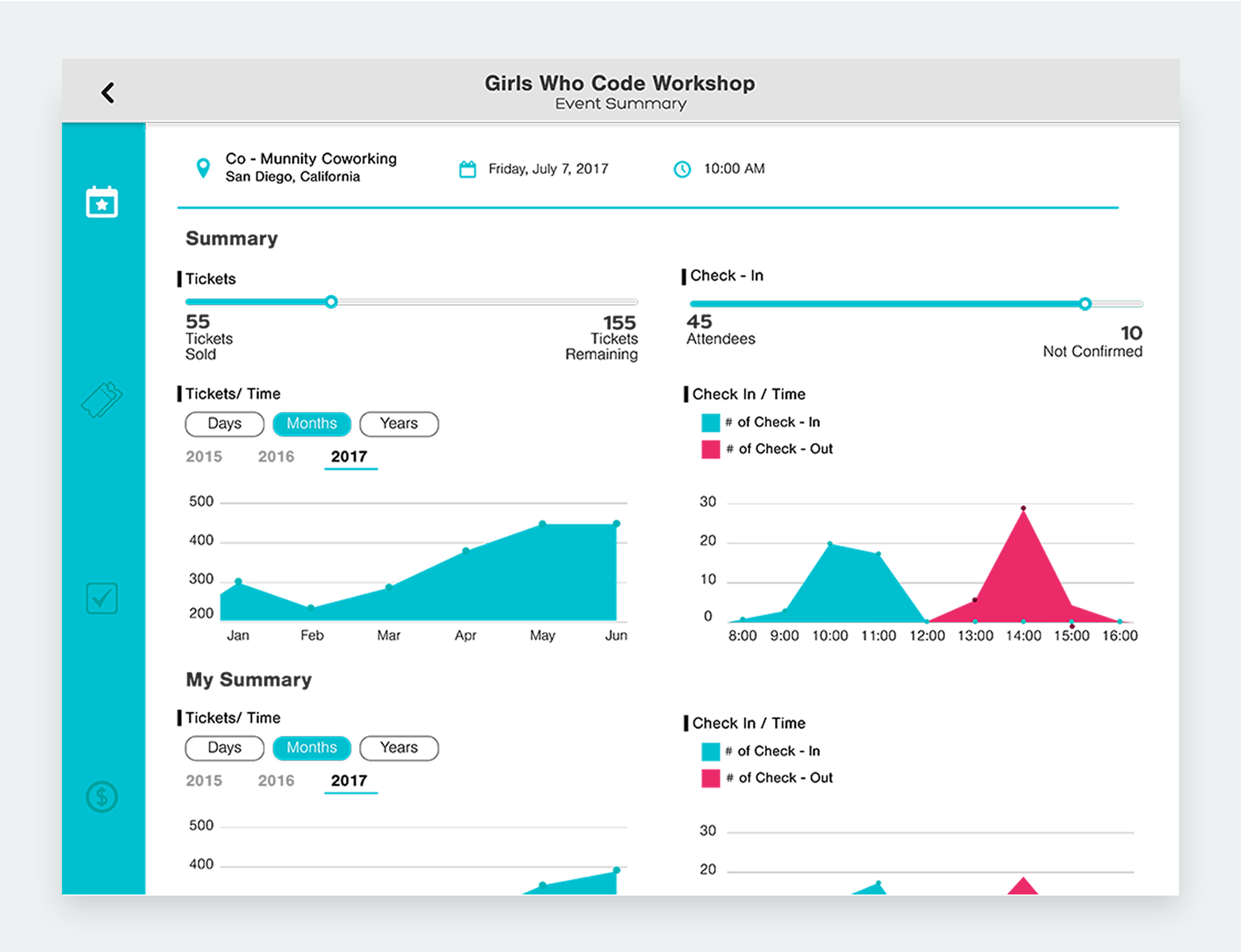
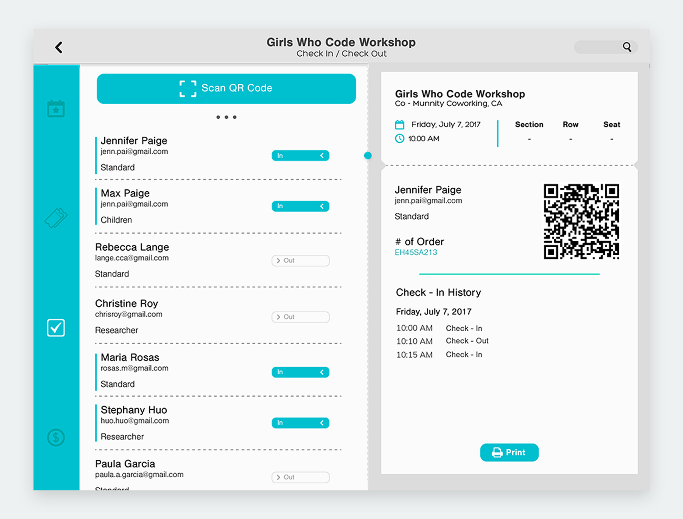
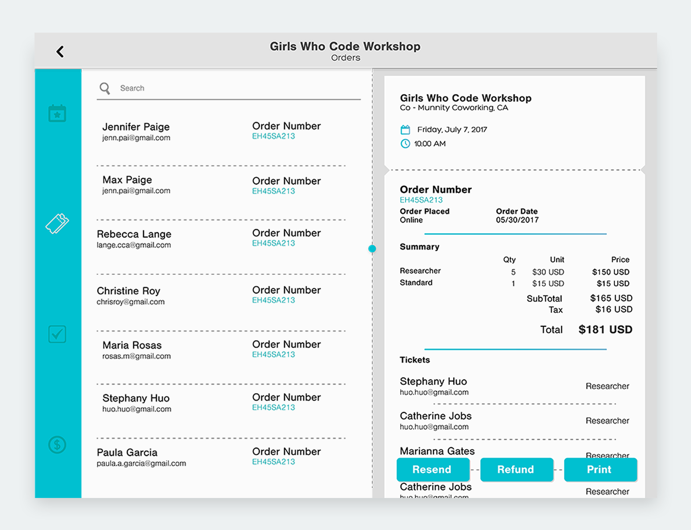
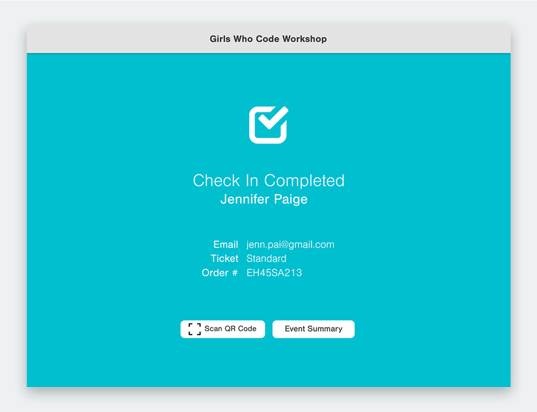
For the look and feel of the new app, it was important that we communicated ease of use and accesibility first and foremost. We went for a clean and sophisticated look and feel by using carefully designed alignment and neutral colours to frame content and bring in a sense of layering to create contrast and hierarchy.
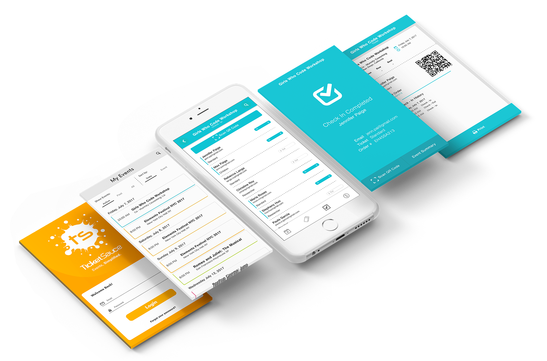
IPHONE
The Iphone UI was designed to help the event managers on the go, allowing them to access most of the functions in the iPad version with ease. It's also highly customizable and easy to adapt to a client necessities with colors and characteristics in registration or in the order view.
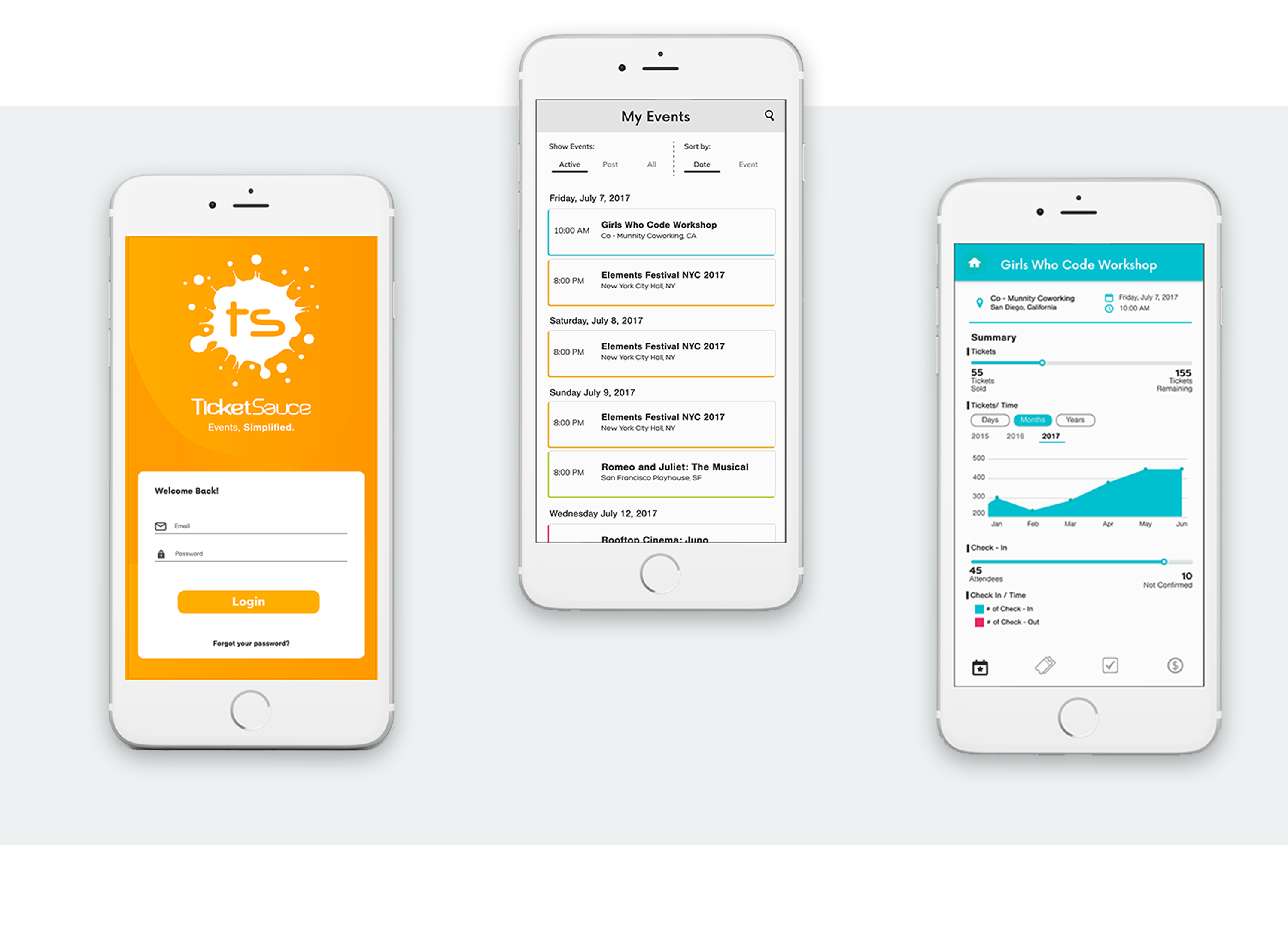
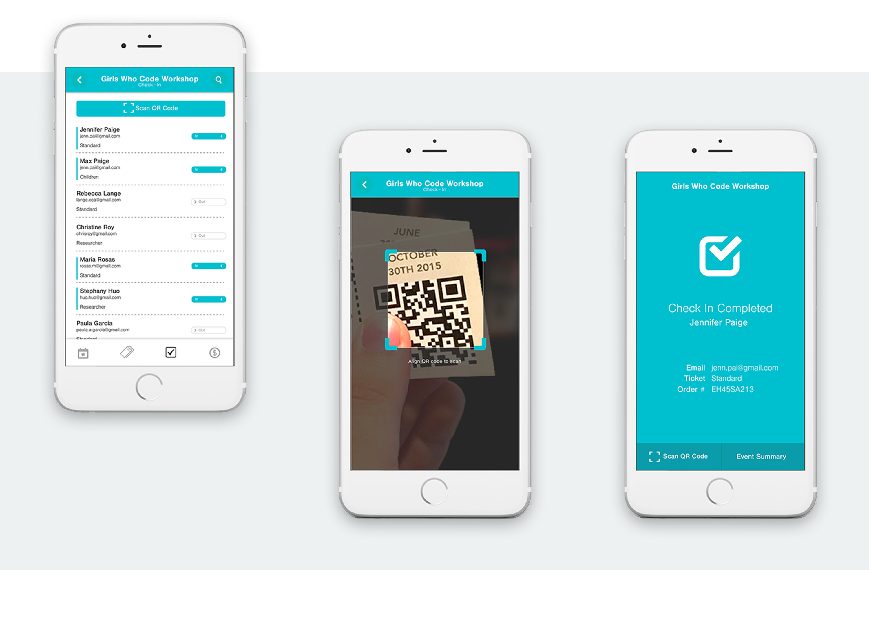
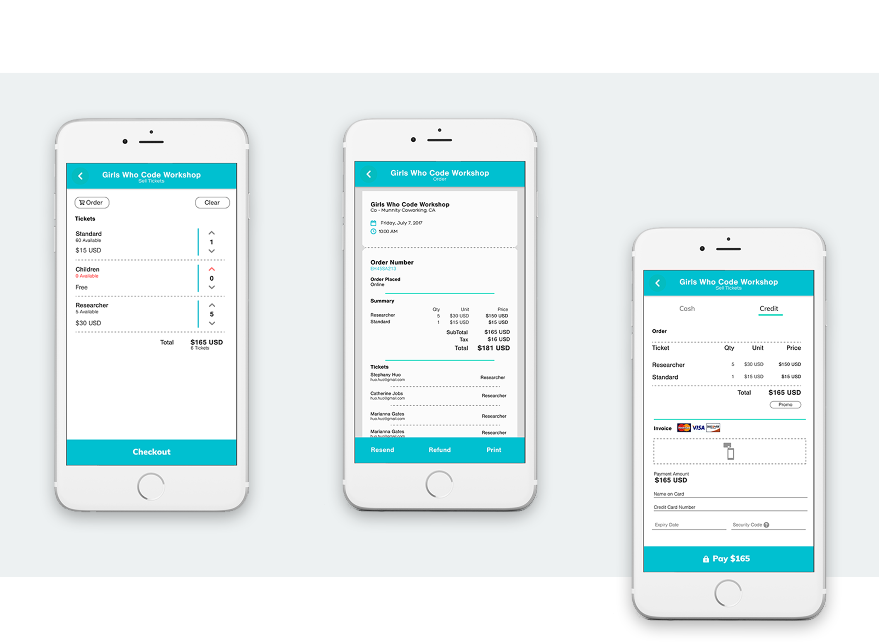
The proposal was accepted by Ticket Sauce and is currently in development.
A more complete visualization of the data can be found on Tableau Public. Right Here!
Did you enjoy looking at this project? Here are some other projects you might enjoy as well.
Online sales platform for Peipeile dough outside of China.
Redesign of the login and room reservation interaction at a hotel website.
.
Redesign of the login and room reservation interaction at a hotel website.
Redesign of the login and room reservation interaction at a hotel website.
Udacity Bussiness Analyst's Capstone Project.